|
|
|||||||||||||||||||||||||
|
|
|||||||||||||||||||||||||
|
|
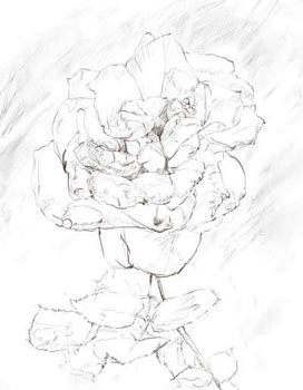
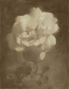
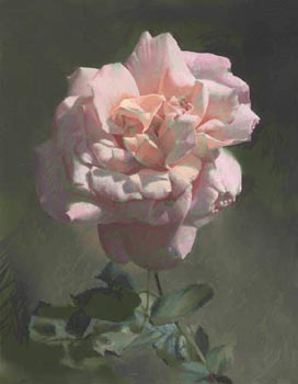
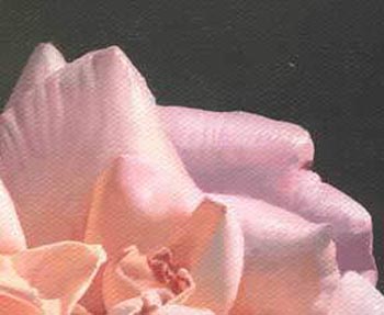
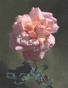
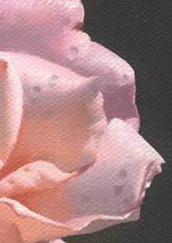
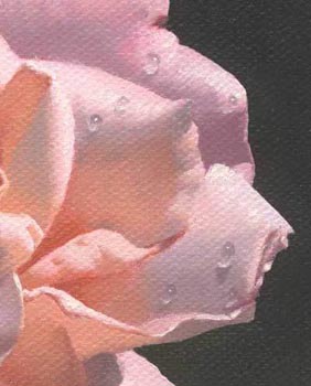
Pink rose with ant
The goal of the classical painting is not to depict objects as close to nature as possible, but to compose a beautiful composition of color, tone and texture. Spread linseed oil on each well-dried previous layer immediately before you begin the next layer. This leads to a better contact of the paint of the dry layer with the paint of the next layer. It also improves the process of dry brush blending. Pencil Drawing
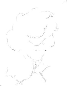
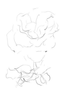
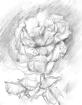
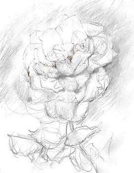
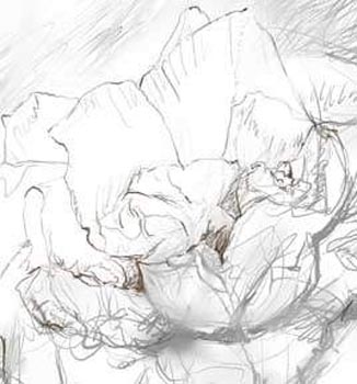
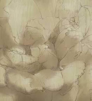
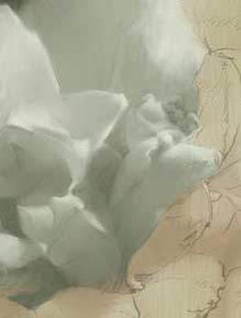
The main of the pencil drawing is to create a precise structure of borders between areas of highlight and light, light and halftone, halftone and shadow, and reflections. Pencil Drawing Composition
Ink Drawing After you have made a pencil drawing on the canvass, draw it out in ink. Imprimatura, the first oil layer, will wash away the pencil, leaving the ink drawing as the first layer of your painting. The ink drawing remains, and the artist doesn't have to draw the composition again
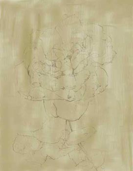
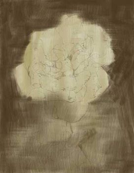
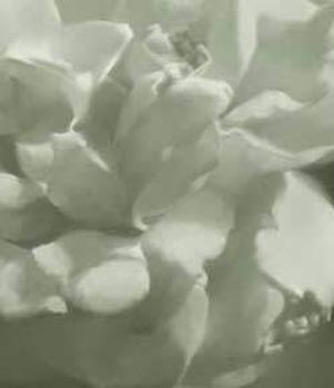
Imprimatura Imprimatura is the first oil layer in the Flemish painting technique. Imprimatura must have a neutral olive hue. The degree of darkness or lightness of imprimatura should be chosen in relation to the largest light area of the future painting
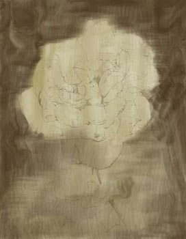
Umber Underlayer Imprimatura is now well dried. The technique of making this layer differs significantly from the traditional concept of oil painting: although your medium is oil paint, use it as if you were using watercolor. Remember the golden rule: you make the next layer not to correct mistakes in the previous layer, but you make the previous layer to facilitate work in the next layer.
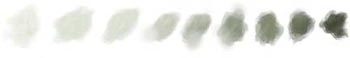
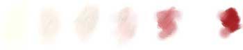
The basic set of paints is the following oil colors: Flake White, Yellow Ochre Light, Red Ochre, Burnt Umber, Prussian Blue, Ivory Black, Madder Lake Deep.
Dead Underlayer Palette The dead layer - is made with Flake White, light ocher, red ocher, burnt Umber, Prussian Blue and Ivory Black. The aim of this Underlayer is penumbra. The picture must look as if its objects were lit with moonlight - olive cold gray color.
Dead Underlayer You have already chosen the tonality. Now you have to rely on it, that is you must repeat the chosen tonality in the dead underlayer. You can make corrections in the tonality without making radical changes. Light are applied thickly, half a tone higher; shadows are very transparent, half a tone lower.
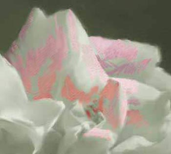
Color Layer The main principle of the first color layer is that you should make shadow areas darker and more colorful. Lighted areas should be made lighter and more colorful too. Working on light areas, use more paste-like mixtures, applying them rather thickly Color Layer Palette
Finishing Miksture Palette Finishing Layer details of textures, thickly applied highlights, bright reflections, and signature. In this layer you may use additional paints: Chinese vermilion extra, cadmium yellow deep, madder lake deep.
Finishing Layer It is in this very stage that our objects gain their final color and shape Work only on the lightest highlight areas Now we can observe a miracle that amazes us in the museum: an optical mix of colors due to the translucency of the layers. At this stage your picture has just been born, and during all your lifetime it will be getting more and more beautiful, because all paints have the property of getting more and more transparent as time passes.
After drying the painting for at least six months, you must apply a cover varnish. Cover the canvas with the regular non-thinned damar varnish using a soft flat varnish brush
Alexei Antonov
|

|
So much for art. How about the artist? I was born in Russia in 1957, and I've been trying both hands (I'm ambidextrous) at art ever since. I can remember my self from the age of two, and when I was three, I was the terror of my mother's make-up kit, as I loved to draw murals on the wallpaper with her lipstick. All through my childhood I continued drawing, (more...) |
Copyright © 2006 artpapa.com / 1art.com / antonovart.com Alexei Antonov. All Rights Reserved